3 min read
Nothing to Polish
Design has always been about shrinking intent distance. Now that more of it happens off a screen, I think judgment comes before polish, and novelty starts to look like a tax.
For forty years, design mostly meant arranging things on a rectangle. Buttons, menus, tabs, cards. Chat, voice, AR and VR each got treated as a side quest with its own rulebook. I think they’re one thing. Call them touchless interfaces, experiences where you say what you want and the system does it, with no hunting and no tapping.
Lately I open an app and feel tired before I touch anything. Finding the setting, the button, the right screen is work. So I go straight to AI, say the thing, and it happens. The most useful tool in my day has almost no visual design at all.
The wrong conclusion
The easy read is that design is losing. The “no UI” crowd has been saying for a decade that the best interface is no interface. Watch where products go next and it looks like they’re right. Once people get used to tools that simply do the thing, color, motion and flourish start reading as noise between you and your goal. Apps will undesign themselves to keep up. Maybe the AI boom pops. The habit it taught won’t.
I think that read gets the ending wrong. The craft just moves. It ends up in decisions nobody sees, like what the system assumes or how it tells you it heard you.
When the goal is feeling, novelty is the product.
When the goal is doing, novelty is a tax.
What craft is beyond the surface
Every interface, touched or touchless, is a translator between what someone wants and what actually happens. Design’s job is to shrink that gap. Call it intent distance. The screen, the mic, the goggles are just the costume.
So where does craft live when there’s nothing to polish? In the quality of attention the system pays to the person:
- How well it understood you, including what you didn’t say.
- How it tells you what it heard, in the fewest words that still let you catch a mistake.
- What it assumes when you don’t specify. Defaults are the new layout.
- How it recovers when it’s wrong.
- When it speaks, when it stays quiet, and the tone of its voice, which is now the whole brand.
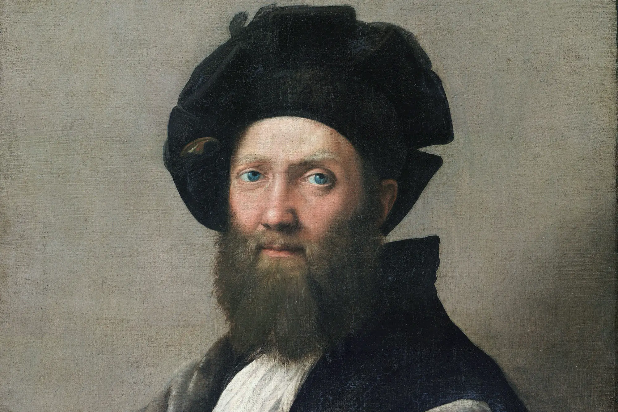
None of that depends on a platform. It’s all judgment. The nearest human analogy is a great waiter or a sharp editor, people whose work you mostly notice by how little friction there is. Castiglione called this sprezzatura, the art that hides its effort.
The paradox designers are standing in
At the same moment users drift toward lightness, designers can build heavier than ever. With code in hand, any headline can ripple, morph or melt into place. There’s nothing wrong with spectacle. When the goal is feeling (a launch, a game, a brand moment), novelty is the product. When the goal is doing, novelty is a tax.
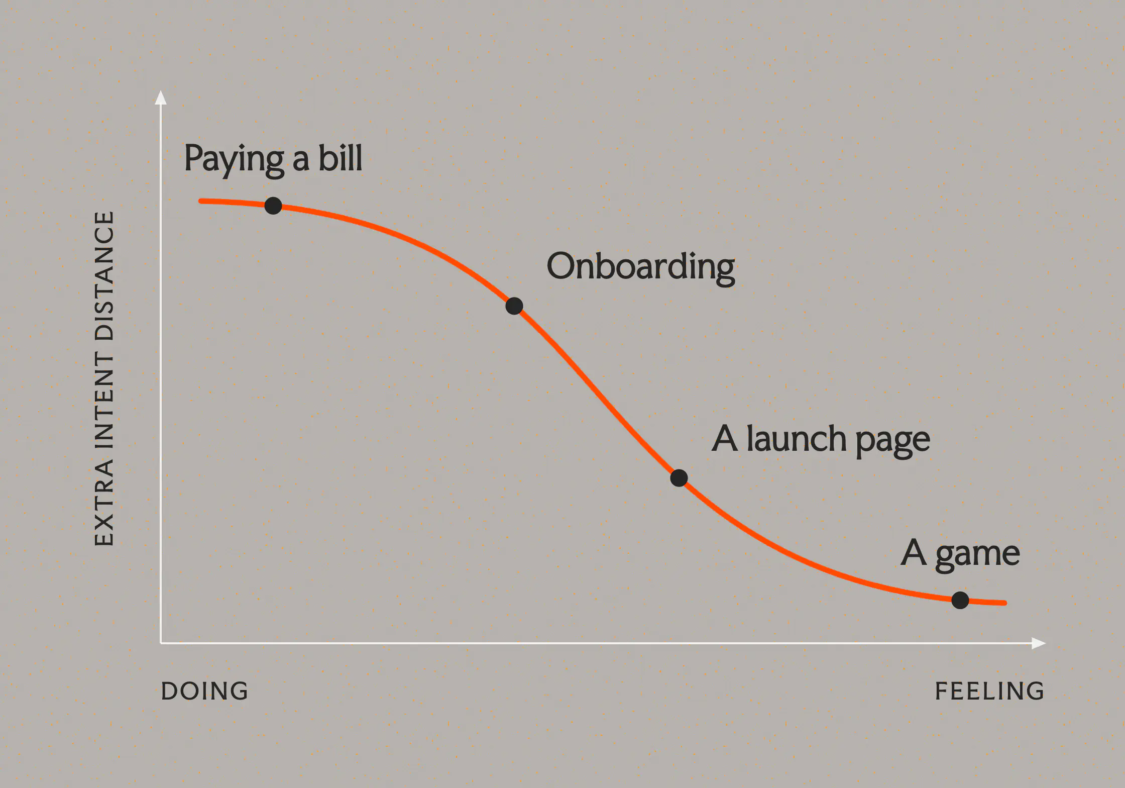
For the next decade, I think the hard part is knowing which situation you’re in, and having the restraint to act on it.
How little does it take?
Composing the surface still matters, and I don’t see that changing. What’s changing is the order. Judgment about when to show up and when to get out of the way is starting to come first, and the products that get it right will close the distance between what someone wants and what happens until there’s nothing left to polish. That’s still craft, it just doesn’t look like it used to.
Researched and edited with AI. Written and proofread by humans.